Home Page › Forums › General Chat › The new request feature is awesome!!!
- This topic has 18 replies, 10 voices, and was last updated 2 years, 11 months ago by
 Hilather.
-
AuthorPosts
-
September 28, 2023 at 6:46 PM #2031610
Just wanted to say that the new model for requests, layout and everything is really, really awesome! Great work!
September 28, 2023 at 7:22 PM #2031613Agreed. So simple to make an offer on a request, or fill one - I've done both today 🙂
September 28, 2023 at 7:53 PM #2031617Yes, I have made more offers in two days than I used to do for maybe 1-2 weeks, it's so much more convenient!
September 29, 2023 at 3:42 PM #2031838No doubt what a great job Hunter has done!
September 29, 2023 at 10:59 PM #2031938Yep, awesome new feature.
That they are still actively improving as well. Was nice to see the offered points total appear on images today.
September 30, 2023 at 5:14 AM #2031971@warrant63 Requesting that the points banner be placed on the bottom of the images, instead of near the top, as it blocks off the faces of almost every single request currently that is a character request.
See example image:
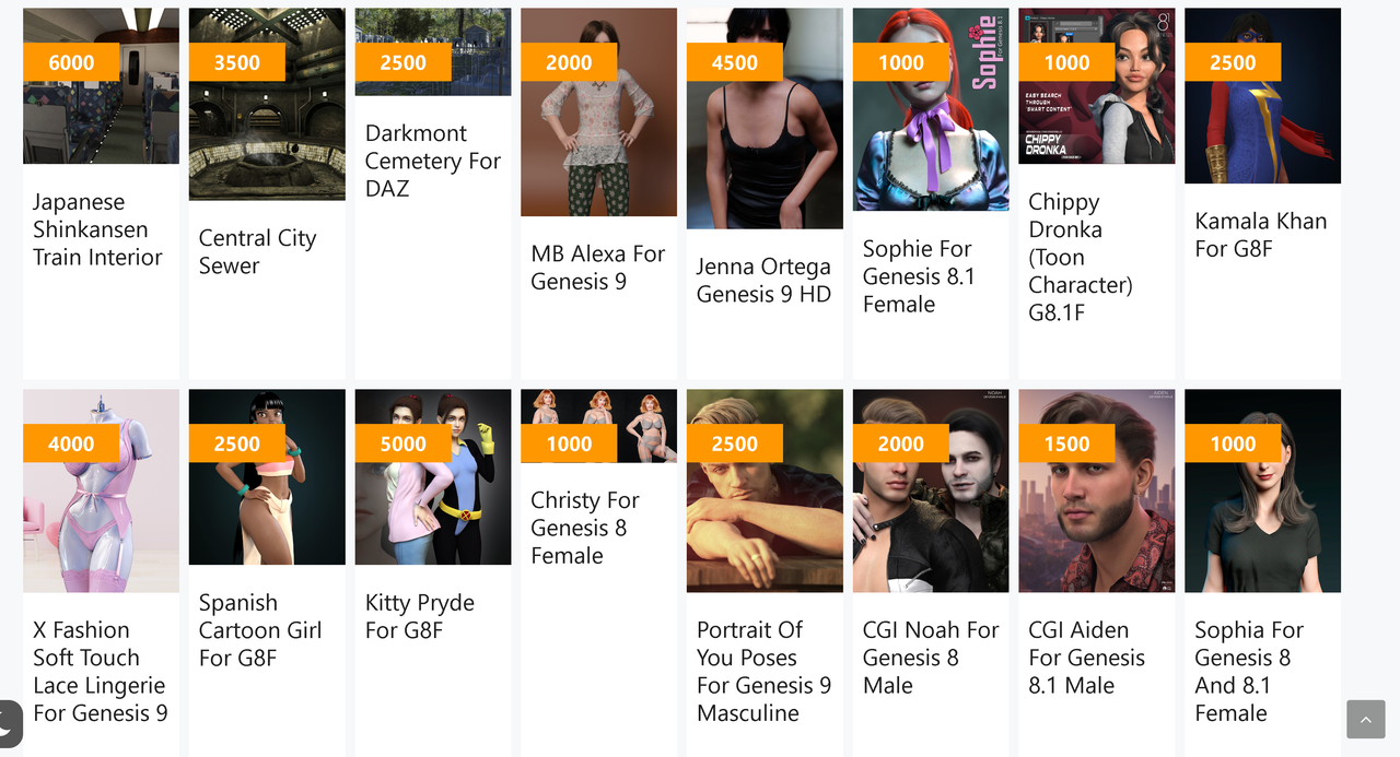
Every page of the requests is pretty much the same thing, with the bulk of the character requests having their faces covered up by the current placement of the points banner.
September 30, 2023 at 7:08 AM #2031982New Feature is awesome But as Halaster says, the whole thing looks not good. Also, can we please organize the long sticky notes list in a different manner? It keeps growing daily. We have discussed this problem several times before. But who am I to suggest?
Good luck with that.September 30, 2023 at 7:43 AM #2031987.. changing the top: 36px; to bottom: 8px; in this class .site-main .generate-columns.reward-item::after would do the trick.. 🙂
 September 30, 2023 at 9:52 AM #2032016
@halaster @gladson1976 ▶ The problem with this is that the fixed point is the column's top left corner. So if a long picture meets a long item name the reward title would stretch the box even further (+ don't forget that the FILLED tag gets below this Sum field)
-> (https://postimg.cc/qzsT9w70)Currently, this is my best solution for you guys -> (https://postimg.cc/wtW4CyJ9)
@lucafeelgood ▶ There is no point cleaning up the forum when we are currently barely using it + a big chunk of it will be deleted. (Also it's better to use this worktime to improve the new system).September 30, 2023 at 11:15 AM #2032043I like the new system as it streamlines the process. No more sending e-mails one by one, page by page to fill requests. Also I don't have to create a separate post for the main site.
September 30, 2023 at 1:48 PM #2032084@warrant63 .. opacity works too 😀
September 30, 2023 at 3:53 PM #2032114@warrant63 IMHO I think the current points could be much, much smaller, like 25% of what it is now and placed in the left or right bottom. The current total of points is, I believe, a very unimportant piece of data for the vast majority. You will open the page based on the picture (and text), not because of the points....
Otherwise its basically perfect!
September 30, 2023 at 3:55 PM #2032116@chonakz Currently this would be the planned next version 🙂
(https://postimg.cc/LYZGxPRW)
(https://zonegfx.com/forums/topic/%e2%9a%a0-first-day-of-the-request-filling-posting-system-feedback/page/3/#post-2032086)September 30, 2023 at 7:38 PM #2032152Yipeee!
September 30, 2023 at 7:40 PM #2032153 -
AuthorPosts












- You must be logged in to reply to this topic.
