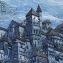
This is a bit of a minor issue, but I felt I should point out that when there's an image with a bright background as banner on the front page (such as right now), some of the options at the top (namely the "F.A.Q", "Free Membership", and "Search" options) are fairly unreadable. Especially when using Night/Dark Mode, which I prefer otherwise. It's a little better with Day Mode/non-Dark Mode, but not amazingly so.
 .
.