Home Page › Forums › Art Showcase › Something Quick I Made
- This topic has 10 replies, 5 voices, and was last updated 4 years, 10 months ago by
 Charley.
-
AuthorPosts
-
November 20, 2021 at 5:53 PM #1750690
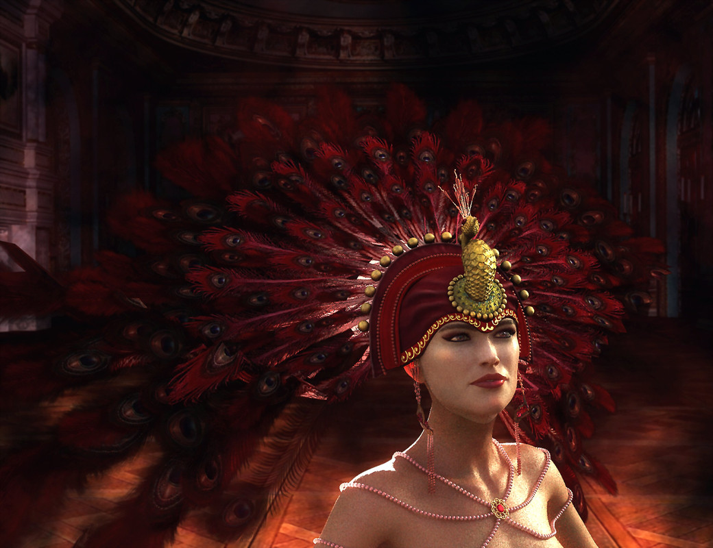
Quick render; quick post work
 November 20, 2021 at 6:43 PM #1750705
I really, really like the lighting, but her headdress gets lost in the background of the same color. Maybe try it with a background with a color opposite on the color wheel? It's pretty cool nonetheless.
November 20, 2021 at 7:28 PM #1750720Thanks for your input - much appreciated! 🙂
November 21, 2021 at 12:33 PM #1750883Well, I see now that everybody has his own taste. I really like that the headdress is "getting lost" in the background. It makes the feel in this render mysterious.
The eyes from the headdress have a nicely fade out to the background.
I like the render and especially the light.November 21, 2021 at 1:23 PM #1750896Thanks @lucafeelgood, I know a lot of people like contrasts, but like you, I'm more of a fan of the more blended/colour matched look. Because I started off in photomanipulation and digital over painting, I tend to use similar methods when I'm post working a render. One of the first things I learnt when I started creating photoart was to blend the colours as much as possible, so as that they would appear as though they belonged together naturally; as opposed to what they actually were; i.e, individual photos pasted together to make an art work. 🙂
November 21, 2021 at 11:38 PM #1751079I also like the headdress "blending" with the backround.
My nit picking though.
The face and the body are different skin tones. you can see at the top of the neck line. makes me think this is a facegen head
There is very strong light coming from the back left and the front right. Like she is sandwiched between 2 spotlights.
Im sure the shadows in the backround were meant to blend her in in an artsy way but its not to my taste. Its splotchy and chaotic.
November 22, 2021 at 8:11 AM #1751130@d0gg0d I used the CB character Eliza with makeup textures from another character. The difference of skintone became apparent to me as soon as it was rendered, but I wasn't going to stress over something I had no intention of selling on dA or offering as a book cover. Despite having bought that headdress ages ago, it was my first time trying it out, so it began as a test render of the character minus a BG. I added the BG in photoshop and to be honest, didn't do all that much by way of correction. Normally, a photomanip can take me over a hundred layers and days to perfect and I've often scrapped the lot and gone back to the drawing board and started all over again lol. I agree with all the points you made, BTW.
But like I said; this was just something quick that was nothing more than a test to see how well the headdress rendered and - rendering aside - it took all of ten minutes. I posted it here because I was interested in hearing honest opinions on something thrown together that qucikly.
Even though I've been using Daz and Poser for over ten years, I only ever used them to render props which I would incorporate into my overpainted mixed media/photomanip art. Time was, I had no characters in my runtime, only props. It's only really in the past two years that I've started experimenting with characters too.
November 22, 2021 at 1:39 PM #1751189I often do that as well. Ill just render something and skip the fine details. I dont have the patience some do, adding tons of objects or random people as filler. It helps with believability though in certain scenes.
So long as your open to critics is all good. When people tell me what they dislike it brings my attention to how I can improve it. However "taste" is not really something that is always shared unless you are trying to appeal to a specific audience.
November 22, 2021 at 2:28 PM #1751199@d0gg0d Agreed. When I first started out at photoart, my first pieces were terrible. I got some wonderful constructive criticism from professional artists who pointed me in the right direction with regards to lighting, perspective, blending, etc. My work improved to the degree where I felt confident enough to sell BG packs and accept commissions for CD book covers, etc. I took a break from creating art to actually taking it seriously and doing a course IRL, and if it hadn't been for the artists who guided me in the right direction, I would never have progressed to that stage. 3D is a different medium for me, so it's as though I'm starting from scratch all over again, as photoshop is my comfort zone.
Sadly, there were some people who started photomanipulation the same time as me and would angrily react to even the kindest criticism. To this day, their stuff hasn't improved in the slightest and they're wondering why they haven't received a Daily Deviation yet lol. They even had instructions underneath their art to the effect of: ''I love the stuff I create and all critics will be blocked''. Although more colourful language than that was used.
November 27, 2021 at 7:20 AM #1752340Given the theme of the character I think it could be quite realistic to have the background splotchy and chaotic [as mentioned].
No high power lighting in an ancient temple, after all - lots of spooky shadows and darkness.
Nice work... 🙂November 27, 2021 at 9:35 AM #1752375@fuzzy3000 Thanks so much for taking the time to look at it and comment; I appreciate it!
-
AuthorPosts









- You must be logged in to reply to this topic.
