Home Page › Forums › Art Showcase › Come here...
- This topic has 20 replies, 5 voices, and was last updated 5 months, 3 weeks ago by
 ADAM.
ADAM.
-
AuthorPosts
-
July 26, 2024 at 7:43 pm #2084486July 27, 2024 at 2:32 pm #2084562
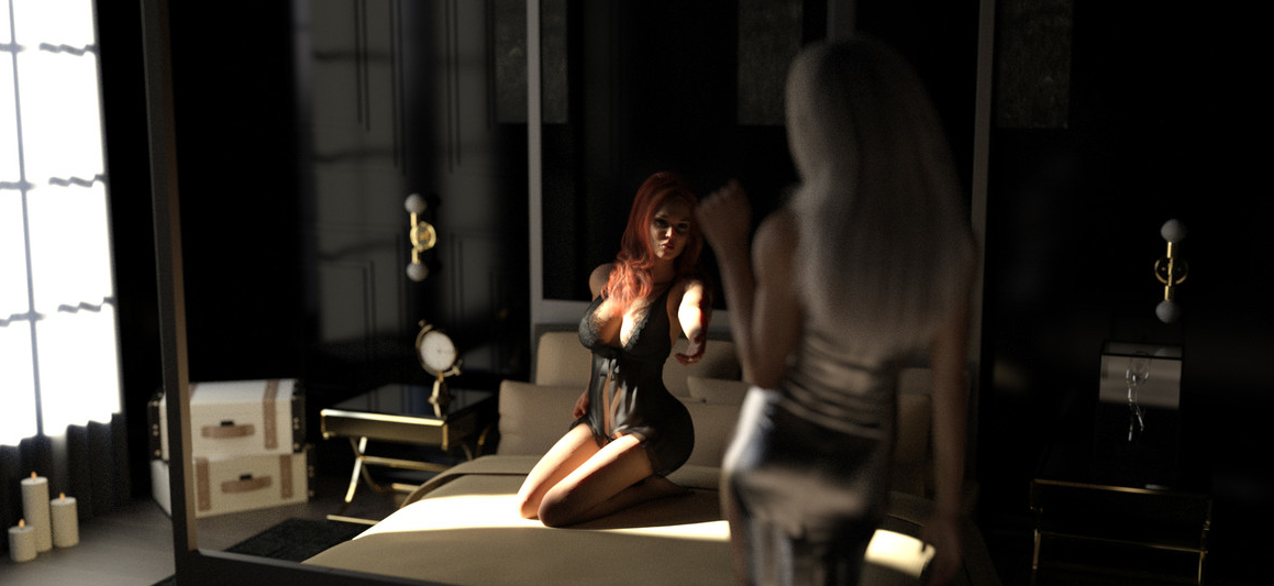
To me it looks like the blur/dof was added in post. especially on the left of the image. weird circular patterns and inconsistent.
Id use dformer or possibly meshgrab to put indentations under her knees/legs to show her sinking into the bed.
Black eyes.
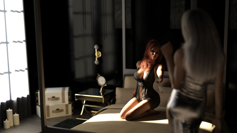
If I crop the sides out it looks way better "to me". (exp 7 days)
 July 27, 2024 at 2:43 pm #2084563
On the one hand i like the window on the left, on the other, a crop like Adam did certainly puts better focus to the characters.
I like the silver skirt, but it seems to have a weird shape at the bottom.
July 27, 2024 at 3:48 pm #2084566Cropping can make or break an image.
I think this works better?
 July 27, 2024 at 9:45 pm #2084594
I like the widow showing where the light is coming from but the weird distortion takes me out of the image. I think that and the shot is a bit to wide. There's nothing going on on the right side. Almost void space. I would have left the window in the crop if it didn't look alien.
Just my taste as well. I like the focus on the characters. While The environment can make a good Picture great it doesn't seem to be the important subject of the picture. Generic bedroom vs a neon lit cyberpunk street.
July 27, 2024 at 9:56 pm #2084595This is nice gaver. The only thing I think could improve is to get the light onto her hand (not just arm) to make this the focus point. This would make the beckoning gesture work better with the "Come here" theme. The rest of it looks fine to me.
July 27, 2024 at 10:02 pm #2084596July 28, 2024 at 1:43 am #2084616Yes and no 🙂 I like that it's more up close and personal. I like that it shows the window. What messes with me is right above the clock the are 2 blurred circles next to each other. One on each side of the gold fixture. The other is the curtain looks like it's smudged at the base or it's bleeding light.
Overall I think the render and each perspective is mostly fine other than the random blurs. Negative space is a good thing sometimes. Maybe I just don't have the mindset for it. But I do like your crop perspective.
July 28, 2024 at 8:33 am #2084654@Adam, DOF was done in DS, no postwork
@Frank, I used subkight only, altough you can play with longitude and latitude, i could not get the light on the hand without puting the face in the shade. While typing, I realise I could (maybey) have tried to rotate the "world"...
Next time Gadget, next time....July 28, 2024 at 9:33 pm #2084721That messes up my theory. Soooo... Here is what I am seeing.

The yellow areas it looks like 2 transparent spheres are hovering next to each other.
The red area after taking a closer look is "just me" since it looks like the light is just very bright and causing the curtain to illuminate oddly.
July 28, 2024 at 10:25 pm #2084725With a bright light/sun coming into a dark room it's common to get a clipping problem. I don't know enough about it to suggest a remedy.
July 29, 2024 at 12:46 am #2084732July 29, 2024 at 2:42 am #2084745Not a big deal but its odd they didnt go away. Maybe those boobs are creating a gravity well and distorting the light. Thanks for running it without DoF.
I like the characters. the right one reminds me of
 July 29, 2024 at 2:46 am #2084746
It looks like one of those visual tricks. When I look at it one way it looks like a reflection of the window, but it's actually the wood paneling design on the wall. The "blurred circles" are just an area where the paneling is smooth. No?
Or... we can just keep on arguing about it. I'm fine either way 🙂 . July 29, 2024 at 4:37 am #2084750
You may be right. Could just be a 1-1000 chance of the perfect cluster @#$% of light and angle.
-
AuthorPosts
- You must be logged in to reply to this topic.


